Understanding the QC reports
This content is for v0.2.0. Switch to the latest version for up-to-date documentation.
As described in the outputs section, you will find, in your output folder, two types of MultiQC reports.
- A global population-wide report, located alongside your subject’s output folders.
Directorysf-pediatric-v0.1.0/
- …
- dataset_description.json
Directorymultiqc/
Directoryglobal-{timestamp}_data/
- …
- global-{timestamp}.html
- participants.tsv
Directorysub-0001/
- …
Directorysub-0002/
- …
- …
- A subject-specific report, located within each subject output folder (if multiple sessions per subject, within each session subfolder).
Directorysf-pediatric-v0.1.0/
- …
- dataset_description.json
Directorymultiqc/
- …
- participants.tsv
Directorysub-0001/ # Example with session
Directoryses-01/
Directoryanat/
- …
Directorydwi/
- …
Directoryfigures/
- …
Directorymultiqc/
Directorysub-0001_ses-01-{timestamp}_data/
- …
Directorysub-0001_ses-01-{timestamp}_plots/
- …
- sub-0001_ses-01-{timestamp}.html
Directoryxfm/
- …
Directorysub-0002/ # Example without session
Directoryanat/
- …
Directorydwi/
- …
Directoryfigures/
- …
Directorymultiqc/
Directorysub-0002-{timestamp}_data/
- …
Directorysub-0002-{timestamp}_plots/
- …
- sub-0002-{timestamp}.html
Directoryxfm/
- …
- …
Opening the global QC report
Section titled “Opening the global QC report”The main purpose of the global population-wide QC report is to enable an easy overview of the distribution of some quality control metrics across your whole dataset. This report will never contain subject-specific images, those can be found in the subject-specific report. As such, you will mostly find plots showing data distribution that you can interact with to highlight potential outliers that require further investigation. Let’s start with the basics.
General statistics section
Section titled “General statistics section”This section will always appear at the top of the MultiQC report. This is where you can get a bird’s eye view of every quality control metrics. You can zoom in on specific section of each violin plot by drawing a rectangle corresponding to your desired field of view. Additionally, you can hover over single points to view the corresponding subject and session.
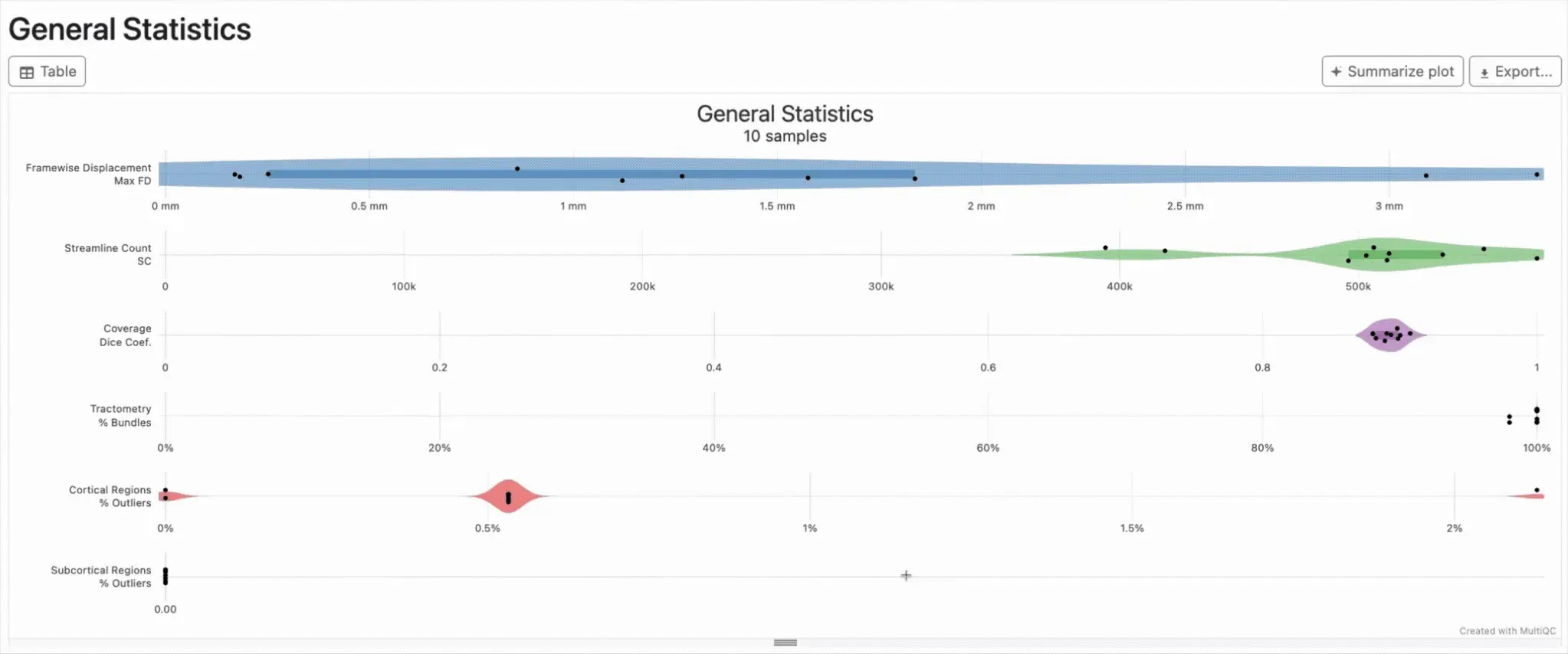
Each row in the general statistic section refers to a specific section that will be detailed further in the global report. Let’s take the example of the framewise displacement metric.
Looking at a specific section of the report
Section titled “Looking at a specific section of the report”Using either the menu on the left of the report, or simply by scrolling down, go to the framewise displacement section. First thing that will get your attention is the green/yellow/red bar just beneath the section’s title. This bar represents the status of each subject, classified either within the passed (green), warn (yellow), and fail (red).

As you can see on the above screenshot, you have 3 subjects that were attributed a pass label, 5 subjects with a warn label, and 2 subjects with a fail label. This is an automatic QC labelling that is performed as part of the pipeline, and you can view the criteria used in the description text just below the status bar. In the example above, subjects with a maximum framewise displacement over 2 mm were labeled as fail, while subjects between 0.8mm and 2mm were labeled as warn. An interesting feature of the MultiQC report is that you can highlight those subjects by interacting with the status bar. To do so, hover over the red section of the bar, a small menu will open, and simply click on highlight. In our case, this will highlight the two subjects that were attributed the fail label throughout the whole report. You can now navigate back to the general statistic section and see where they land on the distribution for the other sections.
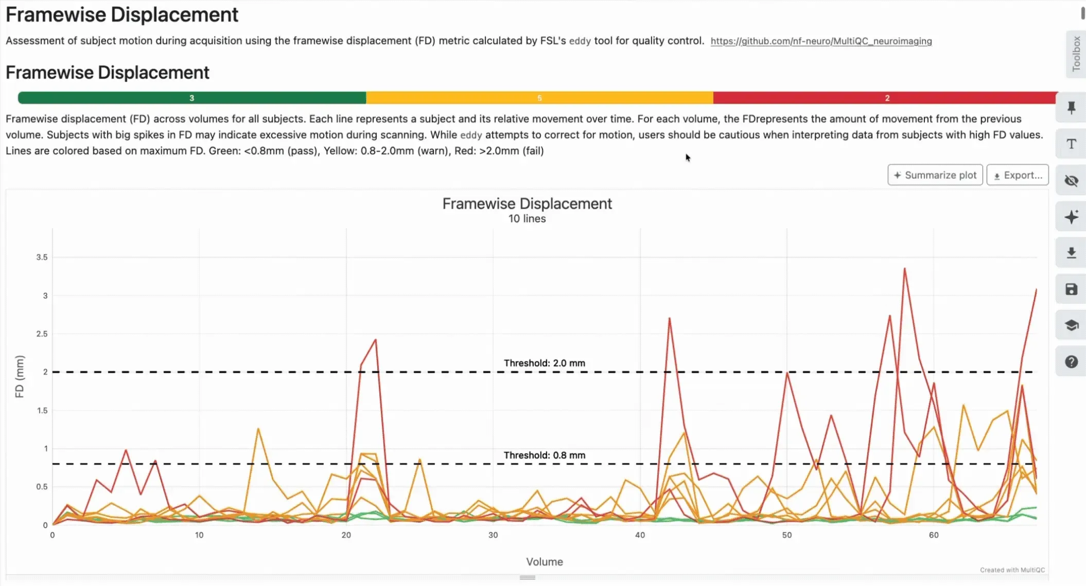
Interacting using the status bar is possible in every section of the report, this will allow you to understand which subjects are your outliers, and note them for further investigation. Once you’ve gone through the report, start opening subject-specific reports!
Opening the subject-specific QC report
Section titled “Opening the subject-specific QC report”Now that you spotted your outliers and created a list of subject-specific reports to open, let’s have a quick tour of what you can find in them. First, as mentioned above, you will find mostly images or GIFs showing visual assessment of each subject data. Each section will come with its own description, telling you what to look for in the shown image. Let’s take the eddy susceptibility correction step as a reference.
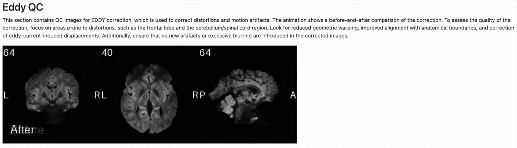
When looking at the GIF above, we can see that the eddy correction step was successfully performed and the resulting image is mostly free of distortions.
Touring the subject-specific report
Section titled “Touring the subject-specific report”For now, we went through a single section showing the before and after eddy current correction. However, multiple other sections are available in the report. Let’s quickly go through them visually.
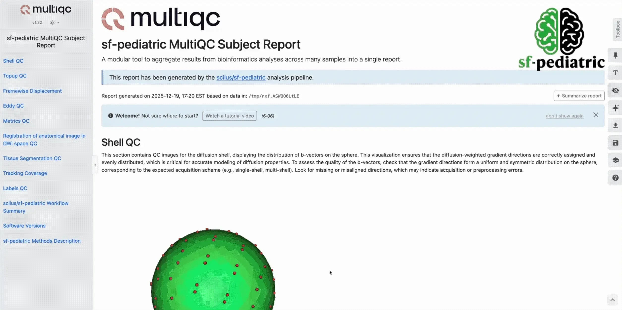
We can see that images are produced for the following sections:
- Q-space sampling with shell distribution
- Topup
- Framewise displacement
- eddy
- Diffusion metrics
- Anatomical to diffusion space registration
- Tissue segmentation
- Tracking coverage of the white matter
- Cortical/Subcortical segmentation
- Pipeline parameters and versions
- Methods boilerplate
For each of those sections, you will get a small description with details of what to look for. If you have any concerns regarding how sf-pediatric processed your data, feel free to open an issue on our GitHub repository!
Using the methods boilerplate in publications
Section titled “Using the methods boilerplate in publications”Each report contains the same methods boilerplate that you can directly include in your publication. Users are encouraged to use this pre-written method section, as it is dynamically tailored to the actual processing steps applied to your data.